What Is UI, and Why Does It Matter?
Every screen in every app, game, or website does one of two things.
It either shows you something — a score, a name, a health bar, a message.
Or it asks you to do something — click a button, type a name, choose an option.
That is all UI is. UI stands for User Interface. It is the layer between the player and the game.
Think about the main menu of any game you have played. It showed you the game’s name. It gave you a Play button, a Settings button, maybe a Quit button. You clicked one and something happened. That is a UI screen doing its job.
Think about a pause menu. It stopped the game and showed you three choices — Continue, Restart, or Quit. Again, that is just a screen showing information and waiting for a decision.
A good UI tells the player what they can do, and makes it easy to do it. A bad UI confuses the player, puts buttons in the wrong place, or has so many options that nobody knows where to click.
In this lesson you will learn how Unity handles UI, how to plan a screen before you build it, and how to use an AI prompt to generate the structure for you.
The Five Types of UI Components
Before we open Unity, you need to know what building blocks exist. These are the same in Unity, HTML, Flutter, Android, iOS — every UI system in the world uses the same five types.
| Type | What It Does | Examples |
|---|---|---|
| Layout | Arranges other components in space | Vertical Group, Horizontal Group, Grid |
| Text Input | Collects text from the user | Text Field, Password Field |
| Action | Does something when clicked | Button |
| Selection | Lets the user choose | Toggle, Checkbox, Dropdown, Tab |
| Display | Shows information, cannot be clicked | Label, Image, Progress Bar |
That is the complete list. Every UI component you ever see is one of these five, or a combination of them. A tab bar is just a row of buttons that behave like a radio group. A dropdown is just a list of choices hidden inside a popup. A card is just a display container with an image and some labels inside it.
Learn the types first. Then learning any specific tool becomes much faster, because you already know what to look for.
The Three Layout Types
A layout component is invisible. You never see it in the game. Its only job is to arrange its children — the buttons, texts, and images inside it — in the correct order with the correct spacing.
Unity has three layout groups. All three exist in HTML, Flutter, Android, and every other UI system under different names.
Vertical Layout Group stacks children top to bottom. Use this for menus and lists.
[ Play         ]
[ Settings     ]
[ Quit         ]
Horizontal Layout Group places children left to right. Use this for toolbars and icon rows.
[ Home ] [ Shop ] [ Profile ]
Grid Layout Group arranges children into rows and columns. Use this for inventory screens, character selection, and icon galleries.
[ Item 1 ]  [ Item 2 ]  [ Item 3 ]
[ Item 4 ]  [ Item 5 ]  [ Item 6 ]
[ Item 7 ]  [ Item 8 ]  [ Item 9 ]
That covers 90% of every UI screen you will ever build. Complex screens are just these three layouts nested inside each other. A settings screen might be a vertical group containing several horizontal rows. An inventory might be a vertical group with a header and a grid below it.
Planning a Screen Before You Build It
This is the step most beginners skip. They open Unity, start dragging buttons around, and end up with a screen that looks messy and does nothing useful.
The better way is to plan on paper first.
For any screen, ask three questions:
- What does the player need to see on this screen?
- What can the player do on this screen?
- Which of these are necessary, and which are just nice to have?
Example — A Main Menu
| Element | Type | Necessary? |
|---|---|---|
| Game Title | Display (Text) | Yes |
| Play Button | Action | Yes |
| Settings Button | Action | Yes |
| Quit Button | Action | Yes |
| Version Number | Display (Text) | Nice to have |
| Credits Button | Action | Nice to have |
Now you know exactly what you are building before you touch Unity. Four actions, two display labels, arranged top to bottom. Vertical layout. Done.
If you skip this step, you will build a screen with ten buttons, half of which do nothing, because nobody decided what they should do.
Try it. Think of any game you have played this week. Write down every element on its main menu. Estimate whether each one is necessary. Count how many buttons there are. Good menus are short. Bad menus have too much on them.
The Unity Canvas
Now let us open Unity.
All UI in Unity lives inside a Canvas. The Canvas is a special GameObject. Every button, text, image, and slider must be a child of a Canvas. If it is not inside a Canvas, Unity will not render it as UI.
Think of the Canvas as a sheet of paper. Everything you draw must go on the paper. Move the drawing off the paper and it disappears.
How to Create a Canvas
Right-click in the Hierarchy panel → UI → Canvas.
When you do this, Unity creates two things:
- The Canvas GameObject.
- An EventSystem GameObject.
Both are required. Do not delete either of them.
The EventSystem — The Part Everyone Forgets
The Canvas draws the UI. But drawing is not the same as listening.
The EventSystem is what receives input. It listens for mouse clicks, finger taps, and keyboard presses, and it decides which UI element the input belongs to.
When you click a button, the EventSystem answers the question: “The player clicked at position (540, 320) on the screen. Is there a button there? If yes, run its click event.”
Without an EventSystem, buttons render but do not respond. You can click them all day and nothing happens.
One rule: one EventSystem per scene. Not one per Canvas. If you accidentally delete it, right-click in the Hierarchy → UI → Event System to create a new one.
Common student mistake. You copy a Canvas from another scene into your current scene. Unity warns you that there are now two EventSystems and asks what to do. You click OK to keep both. Now your buttons behave strangely — double clicks, buttons that do not respond, input that feels broken. Always keep exactly one EventSystem per scene. Delete the second one.
Canvas Render Mode — Where Does the UI Draw?
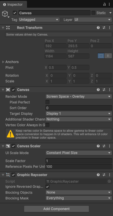
Select your Canvas in the Hierarchy. Look at the Canvas component in the Inspector. The first setting is Render Mode. This controls where the Canvas draws in relation to the rest of your scene.
There are three options.
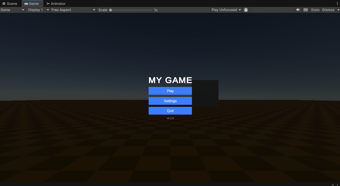
Screen Space – Overlay
The Canvas draws on top of everything. The 3D world renders first, then the Canvas paints over it. The UI does not care about any camera. It is always visible, always on top.
Use this for main menus, pause menus, HUDs, and settings screens. This is the correct choice for 95% of your UI work.
Screen Space – Camera
The Canvas draws at a fixed distance in front of a specific camera. It still looks like a flat overlay to the player, but it is now technically part of the 3D scene. This means 3D objects that are between the camera and the Canvas can appear in front of the UI.
Use this when you want a 3D effect layered on top of your menu — for example, a 3D character preview that appears above your main menu buttons.
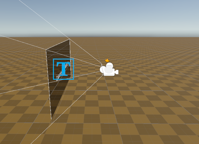
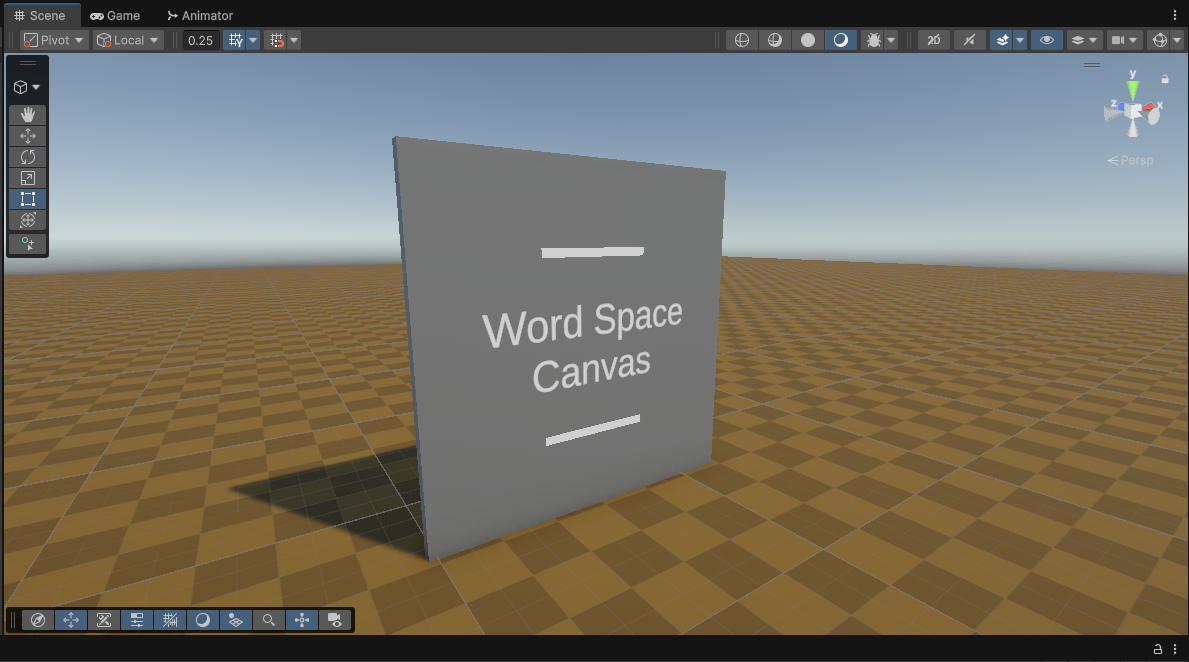
World Space
The Canvas becomes a 3D object in the world. It has a position, a rotation, and a scale. You can walk around it. It can be blocked by walls and other objects. Text becomes smaller at a distance.
Use this for signs inside a game world, control panels on a spaceship, health bars floating above enemies, or any UI that should feel like part of the physical environment.
Which one should you pick? If you are not sure, pick Screen Space – Overlay. It is the default for a reason. Change to the others only when you have a specific reason.
Canvas Scaler — Making UI Work on Every Screen
Look at the Inspector with your Canvas selected. Below the Canvas component, you will see a Canvas Scaler component.
This component answers one question: “What happens to my UI when the game runs at a different screen size?”
The best setting for beginners is:
- UI Scale Mode: Scale With Screen Size
- Reference Resolution: 1920 × 1080
- Match: 0.5
What this means: you design your UI as if the screen is 1920×1080. When the game runs on a different screen — a phone, a small monitor, a wide TV — the Canvas Scaler scales everything proportionally. You do not need to design for every screen size.
Two rules:
- Leave the Canvas Scaler on the default settings until something looks wrong.
- Design inside the reference resolution. Fill the 1920×1080 area. Do not build your menu in a corner of the canvas.
Your Canvas Checklist
Before you add any buttons or text, check these four things:
- A Canvas exists in the Hierarchy.
- An EventSystem exists in the Hierarchy. Exactly one. Not two.
- Render Mode is set to Screen Space – Overlay (unless you have a specific reason to change it).
- Canvas Scaler is on Scale With Screen Size with a reference resolution of 1920 × 1080.
Get these four right and you have a solid foundation. Skip any one of them and you will hit bugs that feel mysterious.
| Problem | What to Check First |
|---|---|
| Buttons do not respond to clicks | EventSystem — is it there? Is there only one? |
| UI looks wrong on a different screen size | Canvas Scaler — is it on Scale With Screen Size? |
| 3D objects are rendering on top of my UI | Render Mode — switch to Screen Space – Overlay |
Adding UI Elements Inside the Canvas
Once your Canvas is ready, you can add elements inside it.
Right-click on your Canvas in the Hierarchy → UI → and pick what you want:
- Text – TextMeshPro — for labels, titles, and any text you want to display
- Button – TextMeshPro — for any clickable action
- Image — for icons and backgrounds
- Toggle — for on/off switches
- Slider — for volume controls or progress bars
Unity automatically places new UI elements as children of the Canvas. If you accidentally place an element outside the Canvas, drag it back in.
Try it. Create a Canvas in a new scene. Add four buttons inside it. Name them Play, Settings, Credits, and Quit. Run the scene. Click each button. Notice that nothing happens yet — that is correct. The UI exists. Wiring it to logic comes in the next lesson.
Adding a Layout Group
Right now your buttons are probably stacked on top of each other in the middle of the screen. That is because there is no layout controlling their positions.
To fix this:
- Right-click on your Canvas in the Hierarchy → UI → Create Empty. Name it
MenuPanel. - Move your four buttons inside
MenuPanelin the Hierarchy (drag them to be children ofMenuPanel). - Select
MenuPanel. - In the Inspector, click Add Component → search for Vertical Layout Group → add it.
- Also add a Content Size Fitter component. Set both Horizontal Fit and Vertical Fit to Preferred Size.
Now your buttons stack neatly top to bottom. Adjust the Spacing and Padding values on the Vertical Layout Group to control the gaps between them.
Try it. Change the spacing from 10 to 40. Watch how the buttons spread apart. Change it back to 12. This is the only control you need for spacing in a vertical menu.
Using AI to Generate a Screen Structure
You now know how to plan a screen and what goes inside a Canvas. The next step is building the structure quickly. This is where AI becomes useful.
The prompt below tells an AI coding assistant exactly what to build. You fill in the SCREEN MODEL section with a description of your screen. The AI returns a C# Editor script. You place it inside a folder named Editor in your Unity project. Then you select your Canvas in the Hierarchy, right-click it, and find your screen under Generate.
Copy the prompt. Fill in your screen. Run it in Claude, ChatGPT, Copilot, or Gemini.
The Prompt
You are writing a Unity 6 Editor tool in C#.

Write a single static class called Generator that generates the
STRUCTURE of a UI screen inside a Canvas. It runs in the Editor only.
The user selects a Canvas in the Hierarchy, right-clicks, and finds
the tool under: Generate → [Screen] Panel.

What the tool DOES
Creates one panel GameObject under the selected Canvas.

Populates the panel with the layout described in the SCREEN MODEL.

Uses VerticalLayoutGroup, HorizontalLayoutGroup, or GridLayoutGroup
on the panel as appropriate for the screen.

Uses ContentSizeFitter on the panel to fit its children.

Anchors the panel to the center of the Canvas.

Registers every created GameObject with Undo.RegisterCreatedObjectUndo
so Ctrl+Z reverses the generation.

Selects the new panel when done and logs a short message.

Guards against running twice: if a panel with the same name already
exists under the Canvas, show an EditorUtility.DisplayDialog offering
to Replace or Cancel. Destroy the old one on Replace.

What the tool does NOT do
No runtime code. No MonoBehaviour that builds UI at Play time.

No click wiring, no action ids, no controllers, no bridge components.

No ScriptableObject data assets. The screen content is hardcoded at
the top of the method as plain C# variables the user can edit.

No styling beyond bare minimum: default colours, default font sizes,
default button backgrounds. The user styles it by hand afterward.

Constraints
Unity 6, built-in UI (UnityEngine.UI) and TextMeshPro.

The script must live in a folder named "Editor".

Use UnityEditor APIs.

Class name: Generator.

Include a private helper method for the Canvas validation check
so it can be reused by the validator.

Menu registration
Two attributes are required: an action item and a matching validator.

Action item:
[MenuItem("GameObject/Generate/[SCREEN_NAME] Panel", false, 10)]
public static void Generate[SCREEN_NAME]Panel()
{
  // full implementation here
}

Validator (greys out the item when selection is not a Canvas):
[MenuItem("GameObject/Generate/[SCREEN_NAME] Panel", true)]
private static bool ValidateGenerate[SCREEN_NAME]Panel()
{
  return IsCanvasSelected();
}

Shared helper used by the validator:
private static bool IsCanvasSelected()
{
  return Selection.activeGameObject != null
      && Selection.activeGameObject.GetComponent<Canvas>() != null;
}

Replace [SCREEN_NAME] with the screen name from the SCREEN MODEL below
(e.g. "Menu", "Settings", "Inventory"). Use the exact same string in
the MenuItem paths, the method names, and the folder path.

Layout rules
Panel:
  anchorMin and anchorMax = (0.5, 0.5)
  pivot = (0.5, 0.5)
  anchoredPosition = (0, 0)
  sizeDelta width = 320 (wider for grid screens, use judgement)

VerticalLayoutGroup (default):
  padding = 20 on all sides
  spacing = 12
  childAlignment = MiddleCenter
  childControlWidth = true
  childControlHeight = true
  childForceExpandWidth = true
  childForceExpandHeight = false

HorizontalLayoutGroup (when a row is specified):
  padding = 10 on all sides
  spacing = 10
  childAlignment = MiddleCenter
  childControlWidth = true
  childControlHeight = true
  childForceExpandWidth = true
  childForceExpandHeight = false

GridLayoutGroup (when a grid is specified):
  cellSize from the SCREEN MODEL (default 160x160)
  spacing = 10
  padding = 10 on all sides
  childAlignment = MiddleCenter

ContentSizeFitter: both axes = PreferredSize.

Title text:
  TextMeshProUGUI, font size 48, bold, white, centered

Section header text:
  TextMeshProUGUI, font size 24, bold, white, left-aligned

Button:
  Image, colour blue (0.24, 0.49, 1)
  Button component
  LayoutElement, minHeight and preferredHeight = 44
  Child TextMeshProUGUI stretched to fill
  (anchorMin 0,0; anchorMax 1,1; offsetMin 0,0; offsetMax 0,0),
  font size 20, centered, white

Version label:
  TextMeshProUGUI, font size 14, grey (0.5, 0.5, 0.5), centered

Helper methods to include
  CreateText(parent, name, content, size, style, color)
  CreateButton(parent, label)
  CreateHorizontalRow(parent, name) — returns the row's Transform
  CreateGrid(parent, name, cellSizeX, cellSizeY) — returns the grid's Transform

Keep the main Generate method readable by using these helpers.

Output format
Return ONLY the following. No explanations outside the code.

Generator.cs — the complete file, well commented, compiles cleanly.

A short markdown block showing the expected Hierarchy after the
tool runs, using a code fence.

SCREEN MODEL

<write your screen model here>
Example — A Pause Menu
Replace the <write your screen model here> line with this:
Screen name: PauseMenu

Content, top to bottom:

1. A title text reading "PAUSED"
2. A button labelled "Resume"
3. A button labelled "Restart"
4. A button labelled "Quit to Menu"
The AI will return a Generator.cs file. Place it inside a folder called Editor inside your Assets folder. If that folder does not exist, create it. Then select your Canvas in the Hierarchy, right-click, and look under Generate → PauseMenu Panel.
Important. The script must be inside a folder named exactly
Editor. Unity only runs Editor scripts that live in an Editor folder. If you place the script anywhere else, it will break your build when you try to export the game.
Self-Check Questions
Before moving on, make sure you can answer these:
- What is the Canvas? Why must all UI elements be inside it?
- What does the EventSystem do? What happens if you delete it?
- What is the difference between Screen Space – Overlay and World Space?
- What does the Canvas Scaler do? Why is it useful?
- What are the three Layout Group types? When would you use each one?
- Name the five types of UI components. Give one Unity example of each.
Practice Tasks
Easy
Create a new scene with a Canvas set up correctly (all four checklist items verified). Add a vertical panel with three buttons: Play, Settings, Quit. Make sure the buttons stack neatly using a Vertical Layout Group. Run the scene and confirm the buttons appear on screen.
Medium
Use the AI prompt to generate a Settings screen. Your screen model should include:
- A title: “SETTINGS”
- A toggle for Music On/Off
- A toggle for Sound Effects On/Off
- A button labelled “Back”
Place the generated script in the Editor folder. Run it on your Canvas. Clean up any spacing issues by hand.
Hard
Design your own screen from scratch — something you would actually want in a game you are making. Write the screen model first (title, elements, layout type). Use the AI prompt to generate the structure. Then, without using the AI, add one additional element by hand that the AI did not generate. Write in the comments of your scene what the element is and why you added it.
What Is Coming Next
You now have screens that look like menus. The buttons exist. The layout is correct. But if you click Play, nothing happens. That is the gap we are going to close.
In the next session, we will write a View Controller — a C# script that connects your buttons to actual game logic. A View Controller is the bridge between what the player sees and what the game does. When the player clicks Play, the View Controller tells the SceneManager to load the game scene. When the player clicks Quit, the View Controller calls Application.Quit().
One script. One job. And once you understand how it works, you can wire any UI screen to any game logic in a few minutes.
Before that session, your task is to experiment. Change your button colours. Move elements around. Try a Horizontal Layout Group and see how it feels different from a vertical one. Build a screen you have never built before — an inventory, a leaderboard, a character select screen — and use the AI prompt to generate its structure.
The more screens you build this week, the faster the next session will go. UI becomes easy the moment you stop being afraid of it and start experimenting.
See you in class.
Contracted by NextSkill a Gamestorms company, delivering this course for Isra University